

Problem
The main issue with the reporting flow was that there was a significant drop-off rate following interaction with the simulation email, which could potentially affect the future customer churn rate.
To identify the main pain points from the user's perspective, the following research methods were used:
Usage data collected from Heap
Qualitative surveys and analysing NPS over users' lifetime
In-depth interviews and usability sessions with users to observe actual behavior
Identified pain points:
Weak user experience
Decreasing engagement
Repetitive training
Weak user experience
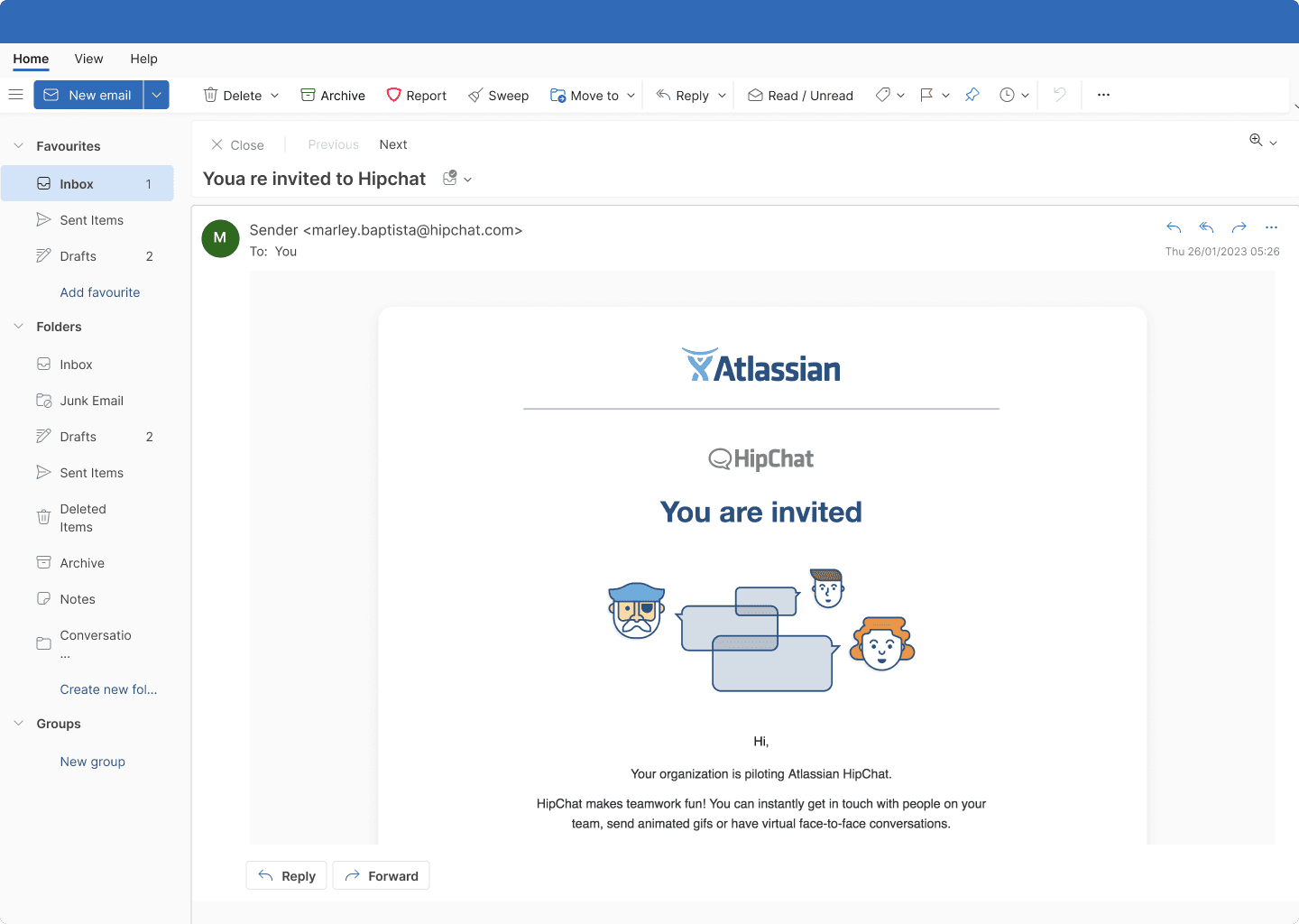
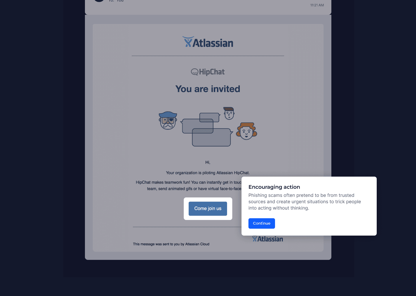
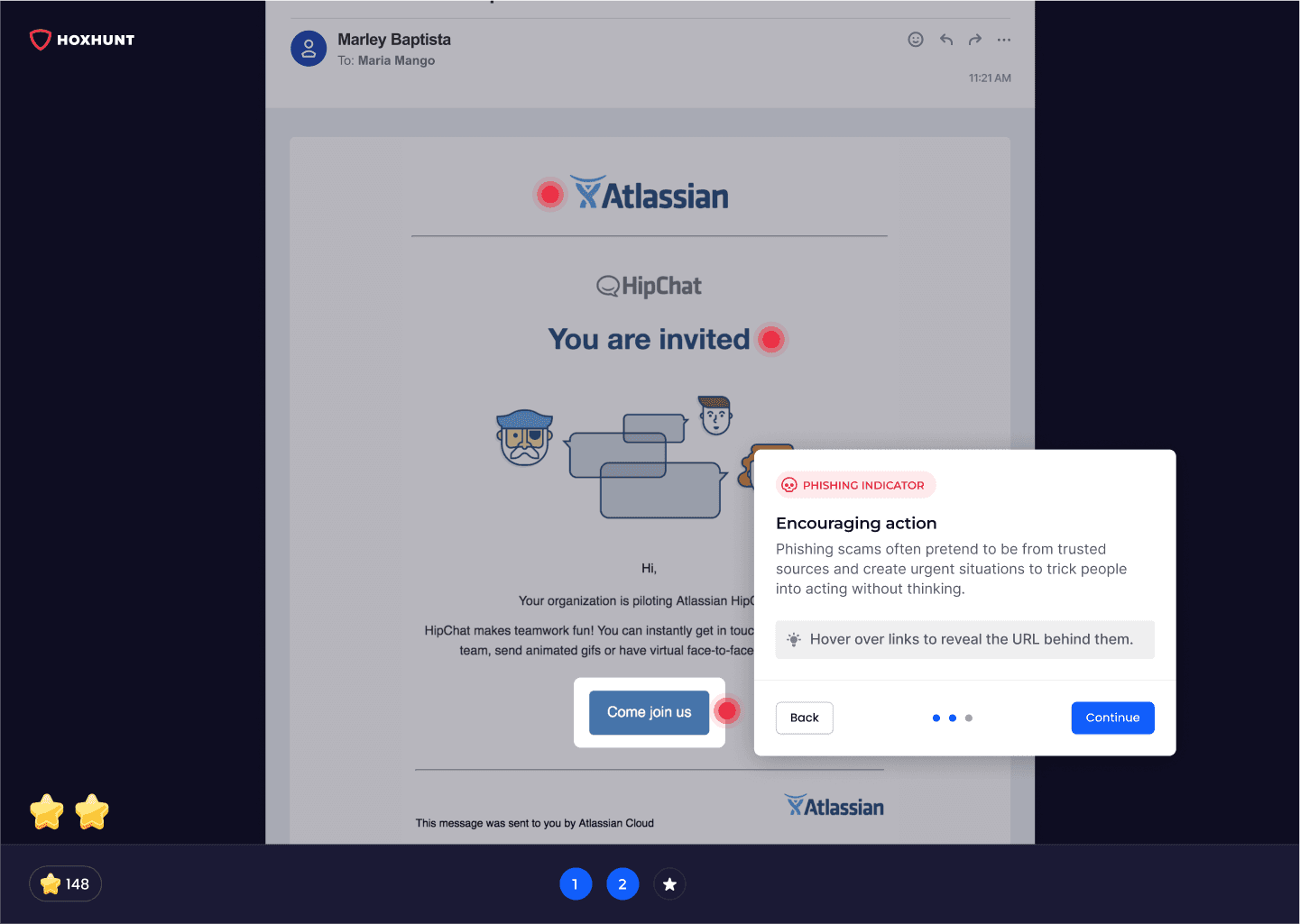
The interface that appeared after the email interaction failed to guide users intuitively through the training session, leading to a significant drop-off rate. The format was a landing page with primary actions positioned at the top, requiring users to scroll all the way to the bottom. Once at the bottom, the scroll was hijacked to bring users back to the top.

How might we?
Weak user experience
Seamless user experience
How might we help the user to complete the micro training?
Same reward
Variable reward
How might we increase the engagement with variable rewards?
Repetitive training
Varied training
How might we add variety to the training?
From scroll to horizontal flow
One frustration among users was that the scrollable content did not clearly indicate when the training was completed or what steps to take next. I revamped the entire concept, transforming the landing page into a horizontal flow with limited actions that users can take.
Solving challenge:
Weak user experience
Users felt that hijacking the scroll on the long landing page felt strange
Current flow
The interface that appeared after the email interaction failed to guide users intuitively through the training session, leading to a significant drop-off rate. When observing the flow, it appears simple, but the scrollable content below the Feedback screen caused significant friction for users.

Proposed flow
The proposed flow seems longer and includes more clicks than the current one. Although there are more steps, each one is simple and users are guided to achieve their goals. Good user experience is about how effectively and pleasantly a person can interact with a product, even if it involves more clicks.

Revamping the flow and UI assets
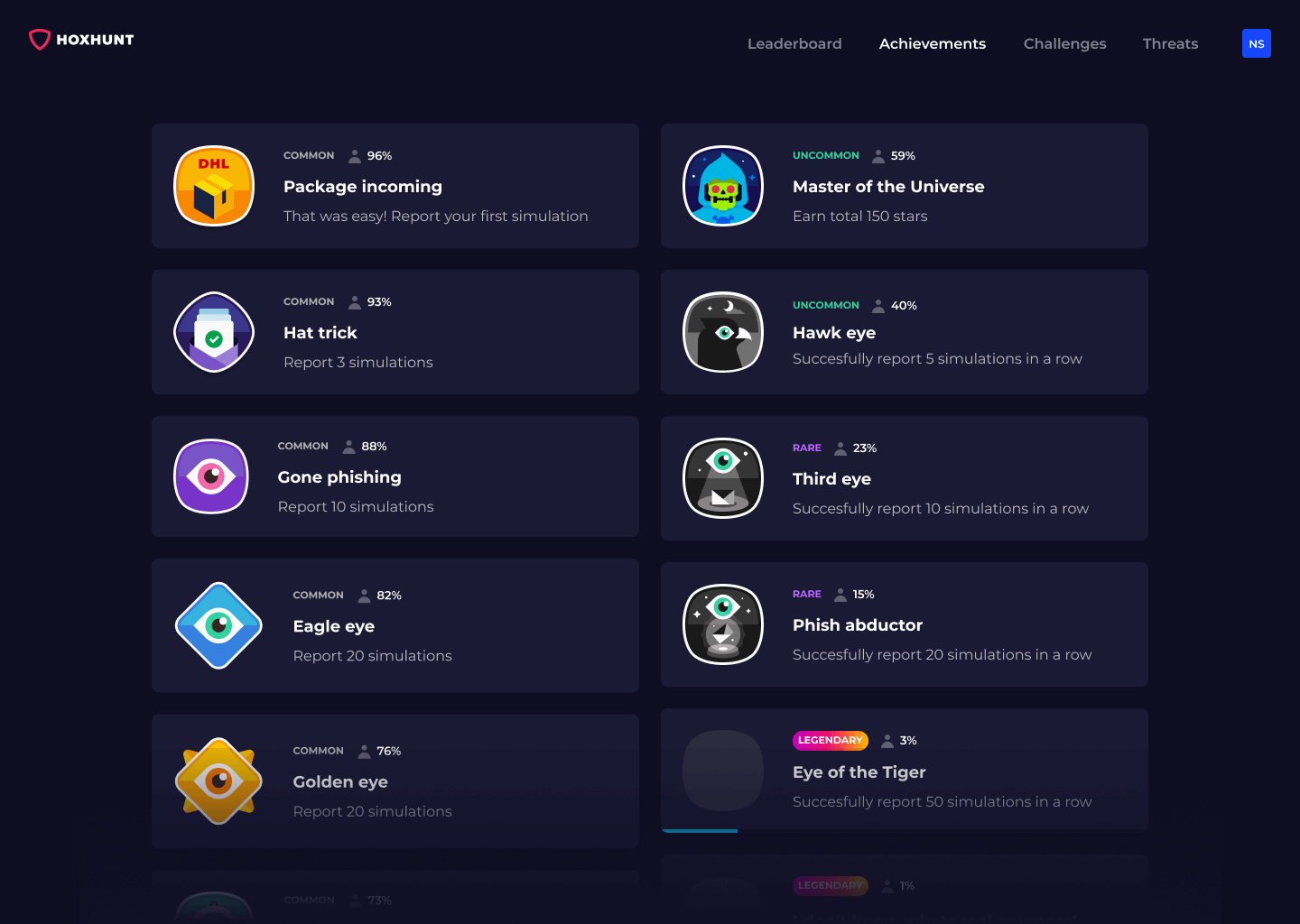
The platform featured gamified elements, but the assets were simple, flat, and quite generic, which suggested a need for improvement in quality. Through rapid iterations and testing, we developed an appealing visual language that ranked highest in card sorting experiences.


Variable rewards
Badges and skill levels can motivate users to achieve higher ranks, especially when there’s a social component to the game. The company enhances this motivation by sharing leaderboards that are sorted by location, department, or other specific attributes. This allows users to earn bragging rights by showcasing how well they have performed and the assets they have gained. Previously, stars were used to compete in seasonal challenges, but this system lacked a feeling of overall progress, leading to user complaints.
From interviewing users, I discovered that while heavy users found the reward system of badges and skill levels motivating, those with a Net Promoter Score (NPS) below 7 were less influenced by these features. Despite this, our strategy focused on catering to heavy users, as they are the most enthusiastic advocates for the product within the company. Keeping these key users engaged and satisfied was a priority, as their support is crucial for fostering a positive product environment and encouraging wider adoption.
The concept of variable rewards keeps engagement high by offering unexpected and diverse incentives, which encourages continuous user interaction and satisfaction.
Solving challenge:
Decreasing engagement
Repetitive rewards no longer spark joy


Homestretch and next steps
With significant improvements made, users now visit the dashboard more frequently. This has allowed us to use the dashboard as a channel to promote and test new additional training options.
Repetitive training
The learning curve begins to level off after six months of training

Outcome
Training completion
Session duration
Niko played a pivotal role in elevating our entire product line. His unique ability to deliver top-tier visual assets alongside his product design work became an invaluable resource for our company.

Mika Aalto
Read more